Junior writers create logos from scratch to promote Hiroshima to foreign visitors
Sep. 16, 2019


It is now less than a year before the debut of the Tokyo 2020 Olympic and Paralympic Games, and people from around the world will soon visit Japan to experience this peaceful sporting event. In light of this, junior writers of the Chugoku Shimbun designed logos to promote the city hoping to inspire foreign tourists to extend their visit to Hiroshima, so they may explore the reconstructed A-bombed city, and consider what they too can do for peace.
Workshop
Creating a design using 70 keywords
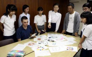
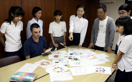
Junior writers asked Daisuke Nakama, 49, advertising agency art director at Mizuma Kobo in Naka Ward, to hold a two-day workshop for them to create logos.
During the workshop, we first drafted a list of words that came to mind when thinking of Hiroshima; places, or foods we wanted to recommend to foreign tourists. Itsukushima Shrine in Miyajima and the Atomic Bomb Dome, both on the World Heritage List, were the first to be named, followed by an additional 70 “keywords” such as streetcars, Hiroshima-na (potherb mustard greens pickled in salt) and Kagura (a Shinto dance with traditional music).
Next, we’d worked out a design using a number of those keywords, following Mr. Nakama’s advice to make it “as simple as possible.” It was difficult to develop a design that conveyed our message, but we managed to draw up twenty ideas by simply changing angles or sizes. We tried to make the best use of color in each image, and we added the English words “Come Visit Hiroshima” to each logo to catch the eye of international visitors.
In the end, three logos were completed with the help of Mr. Nakama. We would like to show them to as many people as possible during our time as junior writers with the Chugoku Shimbun.
The three logos
The O-Torii Gate and the Cenotaph for the A-bomb Victims
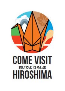
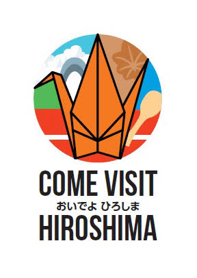
The red color in the lower part of the picture represents the O-Torii Gate of Itsukushima Shrine. A rice scoop, and Momiji manju (maple leaf-shaped waffle cake) were added as well. In the upper left corner is the Cenotaph for the A-bomb Victims in Peace Memorial Park. The Seto Inland Sea is expressed in blue, and the Chugoku Mountains in green. A large origami crane was placed in the center of the design in the hope that visitors would come to learn about the late Sadako Sasaki, a young girl exposed to the A-bomb who continued folding paper cranes while in bed wishing to recover.
A circle made with origami cranes
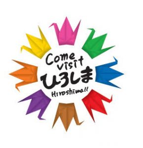
For this design, eight colorful origami cranes are arranged in a circle. Each color depicts a unique specialty of Hiroshima, such as yellow for lemons, or brown for Okonomiyaki. They also resemble a flower blooming brightly. We would like people to know much about the highlights of the prefecture.
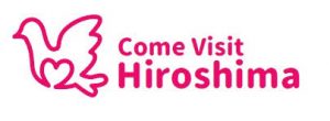
A dove drawn unicursally
The motif of this logo is a dove—widely known as a symbol of peace. It is drawn in a warm red color, and done so with a single pen stroke (unicursally) with the intention of expressing “connection” among nations and people. We imbued within its shape, a sense of movement so people might feel as though it were spreading its wings and flying into the future.
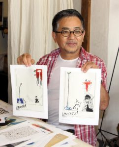
Interview with Masahiro Nohjima, an art director: The key is to make it “abstract”
We asked art director, Masahiro Nohjima, 59, of Local Design Labo based in Higashi Ward, the secret to creating a design worthy of expressing peace and Hiroshima itself. His answer: “the key is to make it abstract.”
Among his many works, one is a picture book proposing the abolition of nuclear weapons by the year 2020, and a poster of alphabet letters made with origami cranes. In 2013, he also collaborated on a poster with illustrator Seitaro Kuroda that incorporated the motif of the manga series Barefoot Gen.
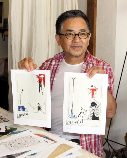
The poster was unveiled at the memorial exhibition for the late Keiji Nakazawa, author of the series. It melds the story’s protagonist, Gen, with a sketch of an upside-down mushroom cloud designed to look like a flower in a flask. Its design, which blended the symbolic character of the A-bombed city of Hiroshima and a novel illustration, had a strong impact when it was released.
When Mr. Nohjima designs a poster related to peace he tries not to express the cruelty of the atomic bomb in a straightforward way, preferring to keep in mind a certain abstract context instead. He said, “The design will be deeply engraved in the minds of people if it makes them think of the meaning or the message behind it.”
This article was written by the following junior writers: Kotoori Kawagishi, 17, Akane Sato, 16, Felix Walsh, 17, Yurina Yunoki, 15, Yuna Okajima, 14, Hitoha Katsura, 14, and Chihiro Tawara, 13.
(Originally published on September 16, 2019)
Workshop
Creating a design using 70 keywords
Junior writers asked Daisuke Nakama, 49, advertising agency art director at Mizuma Kobo in Naka Ward, to hold a two-day workshop for them to create logos.
During the workshop, we first drafted a list of words that came to mind when thinking of Hiroshima; places, or foods we wanted to recommend to foreign tourists. Itsukushima Shrine in Miyajima and the Atomic Bomb Dome, both on the World Heritage List, were the first to be named, followed by an additional 70 “keywords” such as streetcars, Hiroshima-na (potherb mustard greens pickled in salt) and Kagura (a Shinto dance with traditional music).
Next, we’d worked out a design using a number of those keywords, following Mr. Nakama’s advice to make it “as simple as possible.” It was difficult to develop a design that conveyed our message, but we managed to draw up twenty ideas by simply changing angles or sizes. We tried to make the best use of color in each image, and we added the English words “Come Visit Hiroshima” to each logo to catch the eye of international visitors.
In the end, three logos were completed with the help of Mr. Nakama. We would like to show them to as many people as possible during our time as junior writers with the Chugoku Shimbun.
The three logos
The O-Torii Gate and the Cenotaph for the A-bomb Victims
The red color in the lower part of the picture represents the O-Torii Gate of Itsukushima Shrine. A rice scoop, and Momiji manju (maple leaf-shaped waffle cake) were added as well. In the upper left corner is the Cenotaph for the A-bomb Victims in Peace Memorial Park. The Seto Inland Sea is expressed in blue, and the Chugoku Mountains in green. A large origami crane was placed in the center of the design in the hope that visitors would come to learn about the late Sadako Sasaki, a young girl exposed to the A-bomb who continued folding paper cranes while in bed wishing to recover.
A circle made with origami cranes
For this design, eight colorful origami cranes are arranged in a circle. Each color depicts a unique specialty of Hiroshima, such as yellow for lemons, or brown for Okonomiyaki. They also resemble a flower blooming brightly. We would like people to know much about the highlights of the prefecture.
A dove drawn unicursally
The motif of this logo is a dove—widely known as a symbol of peace. It is drawn in a warm red color, and done so with a single pen stroke (unicursally) with the intention of expressing “connection” among nations and people. We imbued within its shape, a sense of movement so people might feel as though it were spreading its wings and flying into the future.
Interview with Masahiro Nohjima, an art director: The key is to make it “abstract”
We asked art director, Masahiro Nohjima, 59, of Local Design Labo based in Higashi Ward, the secret to creating a design worthy of expressing peace and Hiroshima itself. His answer: “the key is to make it abstract.”
Among his many works, one is a picture book proposing the abolition of nuclear weapons by the year 2020, and a poster of alphabet letters made with origami cranes. In 2013, he also collaborated on a poster with illustrator Seitaro Kuroda that incorporated the motif of the manga series Barefoot Gen.
The poster was unveiled at the memorial exhibition for the late Keiji Nakazawa, author of the series. It melds the story’s protagonist, Gen, with a sketch of an upside-down mushroom cloud designed to look like a flower in a flask. Its design, which blended the symbolic character of the A-bombed city of Hiroshima and a novel illustration, had a strong impact when it was released.
When Mr. Nohjima designs a poster related to peace he tries not to express the cruelty of the atomic bomb in a straightforward way, preferring to keep in mind a certain abstract context instead. He said, “The design will be deeply engraved in the minds of people if it makes them think of the meaning or the message behind it.”
This article was written by the following junior writers: Kotoori Kawagishi, 17, Akane Sato, 16, Felix Walsh, 17, Yurina Yunoki, 15, Yuna Okajima, 14, Hitoha Katsura, 14, and Chihiro Tawara, 13.
(Originally published on September 16, 2019)