2023 Hiroshima Summit: Government unveils seven-colored “sense of unity for peace” logo
Dec. 22, 2022
by Junya Kuchimoto, Staff Writer
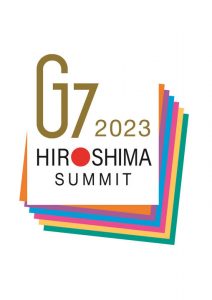
On December 21, the Japanese government unveiled a logo for the summit meeting of G7 (Group of seven industrialized nations) to be held in Hiroshima next May. It is a design that bundles seven-colored origami representing the characteristics and opinions of each country with a G-shaped clip. The logo was created by Keiichi Kusano, 67, a designer from Nagasaki City, the second A-bombed city. The logo expresses a solidarity and sense of unity for world peace through Japan’s traditional origami.
Eight hundred and fifty-four works were submitted for the government campaign, and Prime Minister Fumio Kishida selected one from five finalists. At the award ceremony held at the Prime Minister’s official residence, Mr. Kishida stated, “I would like to convey the message incorporated in the logo both domestically and internationally as well as the significance of the summit, and lead the summit to a successful conclusion.”
At a press interview, Mr. Kusano said, “I incorporated in the logo my thoughts on the importance of peace, which the people of the A-bombed cities desire.” He added that the seven colors represent not only the characteristics and traditions of each country, but also their opinions and assertions regarding global issues.
Kashiwa Sato, a creative director who chaired the selection committee and designed the “Hiroshima Appeals” poster, commented that origami and “HIROSHIMA” are associated with paper cranes, which spreads the image of the prayer for peace. The summit logo is expected to be used for a wide variety of purposes, such as posters at the summit venue, pin badges and related goods.
(Originally published on December 22, 2022)

